5.5 Secondary input field not linked to primary input (L)
5.5.1 WCAG 1.3.1 (A) - Desktop
On the Alternatives to Recall page, selecting a checkbox causes a text input field to appear below it, where users can type in additional details regarding their selection. Visually, the purpose of this text field is clear because it is nested underneath the primary input checkbox.
For screen reader users, however, this grouping is not made obvious. Screen readers announce the input field as “Give details edit multi line blank”—there is no association between the ‘Give details’ label and the preceding question (e.g. ‘Referral to other teams’). This could cause them to become confused about the purpose of the input field; they might not know what they are supposed to enter details for.
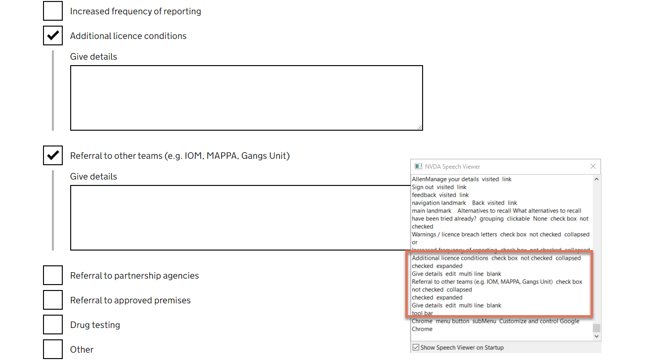
FIGURE 5.8: Give details text input field on Alternatives to Recall page
5.5.2 Code Snippet
<label class="govuk-label"> Give details </label>
5.5.3 Recommendation
Ensure that the secondary input field is associated with the primary input checkbox, both visually and programmatically. This can be done by either:
- Updating the label for the text input field. This would explicitly state the purpose of the field for both sighted and screen reader users:
<label class="govuk-label"> Give details about Additional License Conditions </label>
- Use a visually hidden span to provide this additional information only to screen reader users
<label class="govuk-label"> Give details </label>
     <span class="govuk-visually-hidden">
           about Additional License Conditions
     </span>
<label>- Use an
aria-labelfor the text input field. Note that this would override the visual label.<textarea aria-label="Give details about Additional License Conditions" rows="5"></textarea>