User Vision logo
  • Accessibility Audit
    • Executive Summary
    • Summary of Findings
    • WCAG 2.1 Overview
      • WCAG 2.1 Compliance
  • Project Background
    • Approach
    • How to use this report
    • Understanding our findings
  • I Findings
  • 1 Sitewide Findings
    • 1.1 Users can access content with browser zoom enabled (P)
      • 1.1.1 WCAG 1.4.10 (AA), 1.4.4 (AA) - Desktop
    • 1.2 Links open in a new tab with no warning (H)
      • 1.2.1 WCAG 3.2.2 (A) - Desktop, Mobile, iPad
      • 1.2.2 Recommendation
      • 1.2.3 Resources
    • 1.3 Focus doesn’t move to the top of the page on iOS devices (H)
      • 1.3.1 WCAG 1.3.1 (A), 2.4.3 (A) - iPad, iPhone
      • 1.3.2 Recommendation
    • 1.4 Visible focus indicator doesn’t meet contrast requirements (H)
      • 1.4.1 WCAG 1.4.11 (AA) - Desktop
      • 1.4.2 Recommendation
    • 1.5 HMPPS logo not announced correctly on iOS devices (M)
      • 1.5.1 WCAG 1.1.1 (A), 1.3.1 (A), 2.4.4 (A) - iPad, iPhone
      • 1.5.2 Recommendation
    • 1.6 Adjacent links go to the same target (L)
      • 1.6.1 WCAG 2.4.4 (A), 3.2.4 (AA) - Desktop, iPad
      • 1.6.2 Code Snippet
      • 1.6.3 Recommendation
    • 1.7 Content does not allow for custom text spacing (O)
      • 1.7.1 Content does not allow for custom text spacing
      • 1.7.2 Recommendation
    • 1.8 Acronyms and abbreviations not explained to users (O)
      • 1.8.1 Acronyms and abbreviations not explained to users
      • 1.8.2 Recommendation
  • 2 Probation Search Page
    • 2.1 Uninformative announcement of hint text by screen readers (M)
      • 2.1.1 WCAG 1.3.1 (A) - Desktop, Mobile, iPad
      • 2.1.2 Code Snippet
      • 2.1.3 Recommendation
    • 2.2 Table caption not visually presented (L)
      • 2.2.1 WCAG 1.3.1 (A) - Desktop, Mobile, iPad
      • 2.2.2 Code Snippet
      • 2.2.3 Recommendation
  • 3 Case Summary Page
    • 3.1 Positive: ‘View more details’ programmatically associated with context (P)
      • 3.1.1 WCAG 1.3.1 (A), 2.4.4 (A) - Desktop, Mobile, iPad
      • 3.1.2 Code Snippet
    • 3.2 Navigation landmarks have unique labels (P)
      • 3.2.1 WCAG 1.3.1 (A) -
      • 3.2.2 Code Snippet
    • 3.3 Buttons are coded as links and dynamic updates are not announced by screen readers (H)
      • 3.3.1 WCAG 1.3.1 (A), 2.4.4 (A), 4.1.1 (A), 4.1.3 (AA), 4.1.2 (A) - Desktop, Mobile, iPad
      • 3.3.2 Recommendation
      • 3.3.3 Resources
    • 3.4 Region landmarks do not use unique labelling (M)
      • 3.4.1 WCAG 1.3.1 (A), 4.1.1 (A) - Desktop
      • 3.4.2 Code Snippet
      • 3.4.3 Recommendation
      • 3.4.4 Resources
    • 3.5 Focus Order on Risk page doesn’t match natural reading order (M)
      • 3.5.1 WCAG 2.4.3 (A) - Desktop
      • 3.5.2 Recommendation
    • 3.6 Unnecessary and wordy headings on License Conditions page (M)
      • 3.6.1 WCAG 1.3.1 (A), 2.4.6 (AA), 4.1.1 (A) - Desktop, Mobile, iPad
      • 3.6.2 Code Snippet
      • 3.6.3 Recommendation
    • 3.7 Inconvenient positioning of ‘Apply Filters’ button (M)
      • 3.7.1 WCAG 1.3.2 (A) - Desktop, Mobile, iPad
      • 3.7.2 Recommendation
    • 3.8 Purpose of numbers within the Contact Type filter is unclear (M)
      • 3.8.1 WCAG 2.4.6 (AA) - Desktop, Mobile, iPad
      • 3.8.2 Recommendation
    • 3.9 ‘Open’ link purpose unclear on Risk page (M)
      • 3.9.1 WCAG 1.3.1 (A), 2.4.4 (A) - Desktop, Mobile, iPad
      • 3.9.2 Code Snippet
      • 3.9.3 Recommendation
      • 3.9.4 Resources
    • 3.10 Graphs are inaccessible for screen reader users (M)
      • 3.10.1 WCAG 1.1.1 (A), 1.3.1 (A) - Desktop, Mobile, iPad
      • 3.10.2 Code Snippet
      • 3.10.3 Recommendation
    • 3.11 Search results not announced on iOS devices (M)
      • 3.11.1 WCAG 1.3.1 (A), 4.1.1 (A), 4.1.3 (AA) - Desktop, iPad, iPhone
      • 3.11.2 Recommendation
    • 3.12 Duplicate ARIA id (L)
      • 3.12.1 WCAG 4.1.1 (A) - Desktop, Automated findings
      • 3.12.2 Code Snippet
      • 3.12.3 Recommendation
    • 3.13 Visual heading does not match screen reader announcement (L)
      • 3.13.1 WCAG 1.3.1 (A) - Desktop, Mobile, iPad
      • 3.13.2 Code Snippet
      • 3.13.3 Recommendation
    • 3.14 Input label provided only to screen reader users (L)
      • 3.14.1 WCAG 1.3.1 (A), 3.3.2 (A) - Desktop, Mobile, iPad
      • 3.14.2 Recommendation
    • 3.15 Content spills out of container on iPad (L)
      • 3.15.1 WCAG 1.4.10 (AA) - iPad
      • 3.15.2 Recommendation
  • 4 Google Feedback Form
    • 4.1 Likert scale range not announced to screen reader users (H)
      • 4.1.1 WCAG 1.3.1 (A), 4.1.2 (A) - Desktop
      • 4.1.2 Recommendation
    • 4.2 Apostrophe symbol announced incorrectly (M)
      • 4.2.1 WCAG 1.3.1 (A) - Desktop, Mobile, iPad
      • 4.2.2 Code Snippet
      • 4.2.3 Recommendation
  • 5 Make a Recall Recommendation
    • 5.1 Links to download letters/forms not provided with additional context (M)
      • 5.1.1 WCAG 1.3.1 (A), 2.4.4 (A) - Desktop
      • 5.1.2 Recommendation
      • 5.1.3 Resources
    • 5.2 Further input context not provided to screen reader users (M)
      • 5.2.1 WCAG 1.3.1 (A) - Desktop
      • 5.2.2 Code Snippet
      • 5.2.3 Recommendation
    • 5.3 Task progress status not associated with the link (M)
      • 5.3.1 WCAG 1.3.1 (A) - Desktop
      • 5.3.2 Code Snippet
      • 5.3.3 Recommendation
    • 5.4 Users might miss out on important information because of layout (M)
      • 5.4.1 WCAG 1.3.2 (A) - Desktop
      • 5.4.2 Recommendation
      • 5.4.3 Resources
    • 5.5 Secondary input field not linked to primary input (L)
      • 5.5.1 WCAG 1.3.1 (A) - Desktop
      • 5.5.2 Code Snippet
      • 5.5.3 Recommendation
      • 5.5.4 Resources
    • 5.6 File size and format could be provided to users (L)
      • 5.6.1 WCAG 2.4.4 (A) - Desktop
      • 5.6.2 Recommendation
  • 6 Part A Form
    • 6.1 Tick icon not announced by screen readers (H)
      • 6.1.1 WCAG 1.1.1 (A), 1.3.1 (A) - Desktop
      • 6.1.2 Recommendation
    • 6.2 Navigation is difficult because the document does not use in-built styles (M)
      • 6.2.1 WCAG 1.3.1 (A), 4.1.1 (A) - Desktop
      • 6.2.2 Recommendation
    • 6.3 Link presented as a URL (L)
      • 6.3.1 WCAG 2.4.4 (A) - Desktop
      • 6.3.2 Recommendation
      • 6.3.3 Resources
  • 7 Decision Not to Recall Letter
    • 7.1 Images don’t have alternative text (M)
      • 7.1.1 WCAG 1.1.1 (A), 1.3.1 (A) - Desktop
      • 7.1.2 Recommendation
      • 7.1.3 Resources
    • 7.2 Images not inline (L)
      • 7.2.1 WCAG 1.1.1 (A), 1.3.1 (A), 1.3.2 (A) - Desktop
      • 7.2.2 Recommendation
    • 7.3 Document does not make use of heading styles (L)
      • 7.3.1 WCAG 1.3.1 (A) - Desktop
      • 7.3.2 Recommendation
    • 7.4 Carriage return used for paragraph spacing (L)
      • 7.4.1 WCAG 1.3.1 (A), 4.1.1 (A) - Desktop
      • 7.4.2 Recommendation
  • II Recommendations
  • 8 Suggested Next Steps
  • III Appendix
  • Contact Details
  • Prepared by User Vision for the Ministry of Justice

UV2854 Making Recall Decisions

1.6 Adjacent links go to the same target (L)

1.6.1 WCAG 2.4.4 (A), 3.2.4 (AA) - Desktop, iPad

On the page header, both the HMPPS logo and the adjacent text go to the same target URL. This can result in additional navigation and repetition for keyboard and screen reader users.

Additionally, screen readers announce the two links differently: the first is announced as “HMPPS link” while the second is announced as “Decide is someone should be recalled or not.” This could be confusing for screen reader users who might expect both links to go to different targets. For a similar issue where the purpose of the link is not clear, see ‘Open’ link purpose unclear on Risk page (M) .

Furthermore, ‘HMPPS’ on its own might not give screen reader users enough context to understand its purpose.

Adjacent redundant links highlighted on Start page

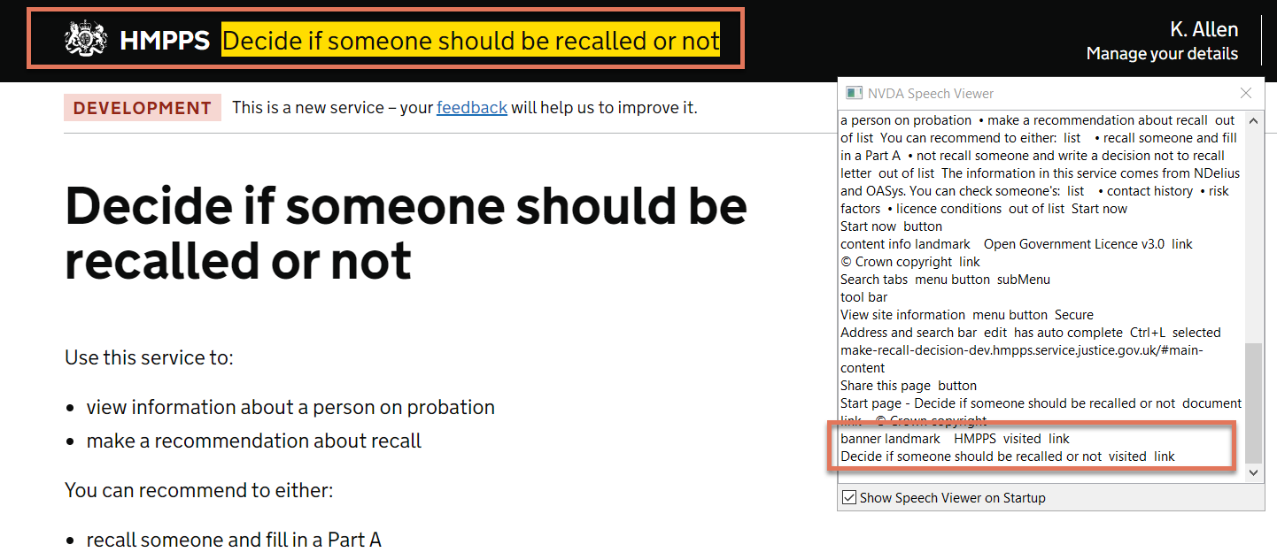
FIGURE 1.8: Adjacent redundant links highlighted on Start page

1.6.2 Code Snippet

<a class="hmpps-header__link hmpps-header__title__organisation-name" href="/">
 ...
        HMPPS
</a>
<a class="hmpps-header__link hmpps-header__title__service-name" href="/"> 
        Decide if someone should be recalled or not 
</a>

1.6.3 Recommendation

Combine both elements into one link. Alternatively, remove the second link since it is redundant. Update the link text for the HMPPS logo to be more descriptive. For example:

<a href="/">
    HMPPS Home Page 
</a>